|
|
Post by Mark on Jul 6, 2006 18:08:52 GMT -5
What are your opinions on the new layout on the site?
|
|
|
|
Post by ymymeatemup on Jul 6, 2006 19:58:33 GMT -5
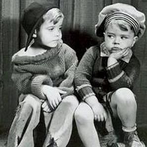
Overall, I like the look of it. But is there a way to get more clarity out of the photos? The kids look like they all came down with some kind of jungle fever. Incidentally, are these your ten favorite members?
|
|
|
|
Post by Mark on Jul 6, 2006 21:40:16 GMT -5
On the first page with Spanky and Alfalfa, I meant for the picture to look "grainy" like the rest of the background and site logo. As for the main menu, a few kids in the pictures (in the circles) may look unclear, likely due to the picture quality not being the greatest to start with. I may see what I can do.
I'm working on a new photo gallery, but many of the pictures aren't going to be of high quality. They were scanned from my printouts, but they're very rarely seen so they should be a "treat" for those who haven't seen them before. I use various picture editing programs to help improve the quality.
The kids in the main menu are not necessarily my top favorites, but many of them are anyway.
|
|
|
|
Post by zootmoney on Jul 6, 2006 23:34:24 GMT -5
Why would you intentionally make it grainy?
|
|
|
|
Post by Mark on Jul 7, 2006 10:05:45 GMT -5
Just to make it different. If you guys don't like it, I'll change it.
|
|
|
|
Post by beatnik1968 on Jul 7, 2006 10:29:35 GMT -5
I like it
|
|
|
|
Post by ymymeatemup on Jul 7, 2006 14:59:52 GMT -5
Just to clarify - for me, it wasn't so much the grainy look of the opening page, but the blueness of the second page. Not that blue isn't a good color to use - there's just a bit too much of it on some of the faces.
|
|
|
|
Post by beatnik1968 on Jul 7, 2006 17:37:25 GMT -5
It makes it look vintage with it grainy
I love it
|
|
|
|
Post by zootmoney on Jul 7, 2006 18:32:41 GMT -5
Then I guess you will be disappointed with the Laughsmith set, since it probably won't be as grainy as the Grapevine, or bootleg issues. Seriously, the B&W photos are are already vintage enough. I didn't buy an expensive LCD monitor to view grainy stuff.
|
|
ina
Junior Member

Posts: 64
|
Post by ina on Jul 7, 2006 19:24:17 GMT -5
I like the layout of the of the webpage, but the only thing you should do is make the background solid black (without the 'grainy' look), and make the blue border smaller so that it will fit the screen. I like the design of the border because it has that 1930-ish feel to it -- an appropriate design for a show from that era.
|
|
|
|
Post by Mark on Jul 7, 2006 20:54:18 GMT -5
The menu page looks best if the computer is set at 1024X768 and up as opposed to 800X600. I'll make it smaller to fit everyone's screens. Easy task.
Bob, I think I see what you're saying. The pictures used in the circles come from different sources and before inserting the pictures I didn't think of editing them to make them all look the same (quality-wise) so they won't look too blue in some of them. I'll work on it.
We seem to have some mixed opinions about the 'grainy' look. Anyone else don't care for it?
|
|
|
|
Post by sidewayscap on Jul 9, 2006 16:39:34 GMT -5
I love the new look!
But is it just me or did you change it very recently? Whatever change is good!!
|
|
|
|
Post by zootmoney on Jul 9, 2006 16:57:27 GMT -5
The design itself is great. But why is it necessary to view old photos grainy. Remember, it wasn't really B&W, back then. Things were actually in color.
|
|
|
|
Post by Mark on Jul 9, 2006 18:11:22 GMT -5
It was changed just the other day, sidewayscap.  It's going to be a lot of work doing the rest of the site. Eeek! Hang in there, folks! |
|
|
|
Post by sidewayscap on Jul 16, 2006 13:59:45 GMT -5
Lol, that's not what I meant! I mean it was changed like a few months ago.
Or did you get that?
|
|